About
Jaeger is a renowned British fashion brand known for its timeless, elegant designs, offering high-quality tailoring and modern, sophisticated styles for both men and women.
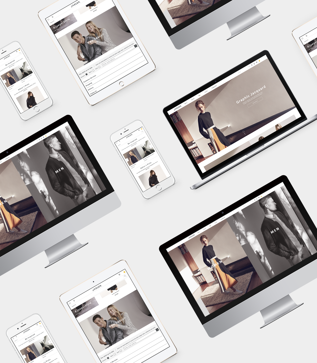
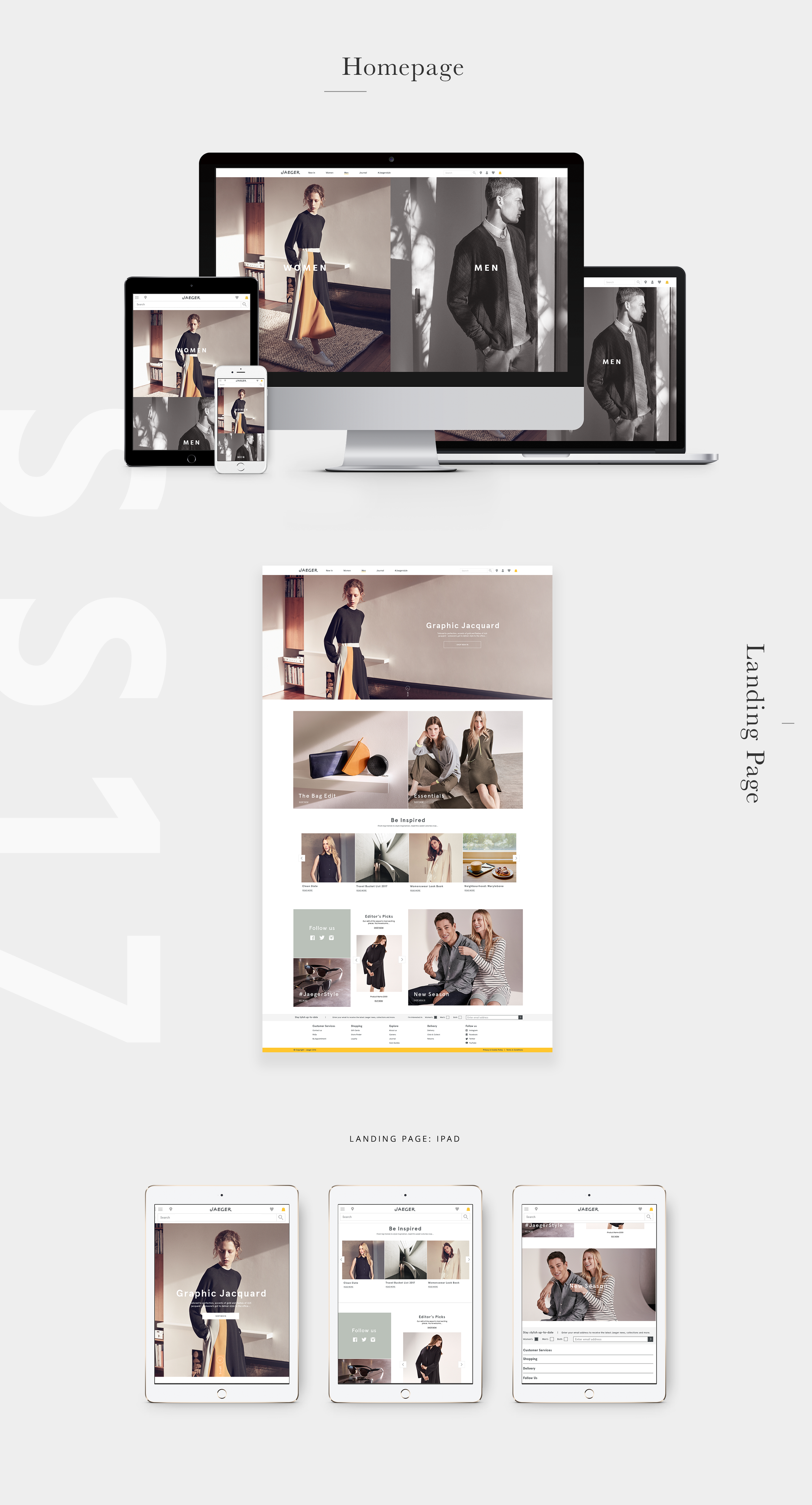
As a Visual Designer at Jaeger, I was tasked with revitalizing the brand’s e-commerce website to create a more intuitive, modern, and responsive experience. The primary focus for my team was to improve the navigation, the homepage, the men’s and women’s landing pages, the Journal (including the Lookbook). size guides, FAQs and Help Centre.
My aim was to align the digital experience with Jaeger’s luxury image while ensuring the website worked seamlessly across all devices, particularly mobile.

Challenges
The Jaeger website wasn’t optimised for smaller screens, resulting in a frustrating user experience on smartphones and tablets. Key sections, like the navigation, homepage, and size guides, didn’t scale properly, making it difficult for users to navigate and engage with the content. This lack of mobile optimisation hindered the overall shopping journey and impacted user satisfaction.
Approach
To address these challenges, I first conducted in-depth research into Jaeger's target audience, competitive landscape, and industry best practices:
— User Testing: I reviewed analytics and observed real users interacting with the current site to identify pain points, especially around navigation and key landing pages.
— Competitive Analysis: Analysing other luxury fashion websites helped inform design decisions, particularly for creating a more seamless, luxury-shopping experience.

Mobile Navigation
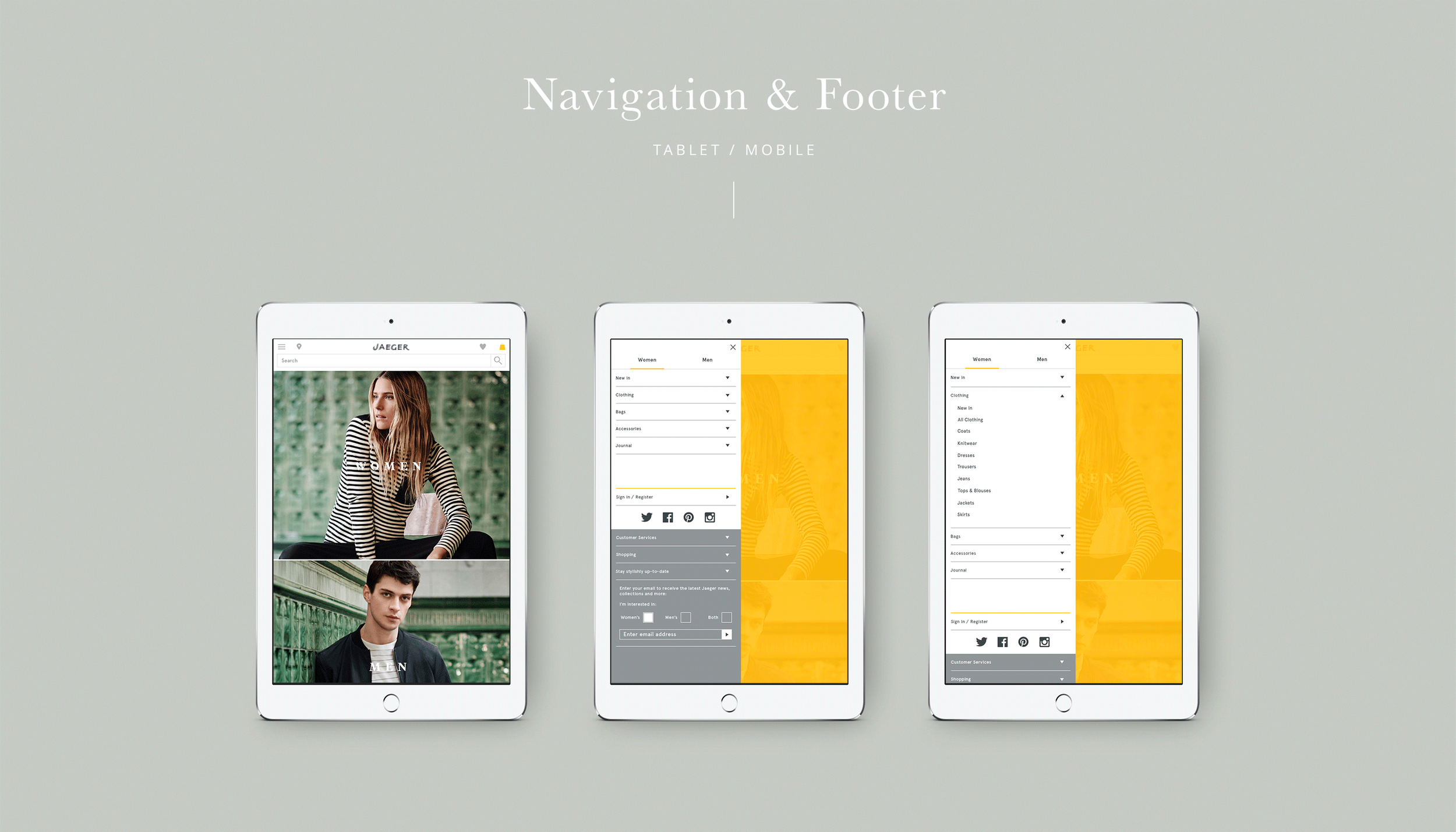
One of the key elements I focused on was simplifying the navigation for smaller screens. The traditional top navigation was replaced with a hamburger menu, which collapsed the links into a compact icon, saving valuable screen space. I ensured smooth transitions when users opened or closed the menu, creating a polished, intuitive experience.
The menu featured two main tabs at the top—Men’s and Women’s — allowing users to easily switch between categories. Each category was expandable using an accordion, making it simple for users to access subcategories like collections, sale items, and more, without cluttering the interface. This structure allowed for quick navigation while keeping the design clean and user-friendly.
Lookbook
I optimised the lookbook for both mobile and desktop to ensure a seamless, engaging experience. On mobile, it was designed to be swipe-friendly, allowing users to easily browse collections with intuitive gestures.
For desktop, the lookbook featured full-width images and smooth animations, offering an immersive, magazine-like feel. Interactive elements, such as hover effects, allowed users to view product details and quickly transition to product pages. This design balanced interactivity and visual appeal, providing a consistent, luxurious experience across devices.

User Testing & Iteration
After implementing the designs, I conducted a round of testing to ensure a smooth user experience. In usability testing, users performed tasks like browsing collections, exploring the Lookbook, and accessing size guides, helping identify navigation pain points.
Outcome
40%
Mobile traffic and engagement rose by 40%, thanks to the responsive design and more intuitive navigation.
30%
The new navigation structure led to a 30% decrease in bounce rates, with users able to find their desired products more quickly.
Want to learn more?
If you're interested in learning about my design process and the challenges I encountered along the way, feel free to reach out for the full case study.
